Photo viewing tip: If you are on a desktop, once page is fully loaded, click on any photo and it should double in size up to 1,000 pixels for a better look at details.
Use Excel and Powerpoint to create room layouts
My process to do a furniture layout like this is so basic, it really doesn’t need a step-by-step. But, okay, here are the principles:
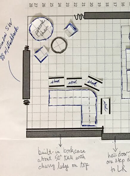
- Measure the four walls of your room, and then use these dimensions to outline a grid on Excel; on mine, one foot = one box. Important: Adjust the pixels within your grid so the height and width are the same — that is, square. Add interior grid lines that will show when printing and lighten the grid lines up to your liking. Add the bold exterior outline to your overall grid. Take a screen shot of your grid and transfer it to Powerpoint; enlarge or reduce it as needed to fit the page. Print out your first copy/worksheet.
- With your worksheet in hand, measure all the fixed elements of your room — draw the windows, doors, projections, etc., by hand right onto your worksheet.
- Return to the computer. Now, using the tools (e.g. boxes and lines, etc.) in Powerpoint, add your windows, doors, projections, etc. At this point, you may need to re-measure — I did — when numbers/boxes don’t add up. Keep working on the Powerpoint page until you believe it has all the fixed elements in place, measured accurately. Print out your final copy and a few extras to cut furniture from. Note: I hand-wrote notes on my copy after printing, but you could also add these in Powerpoint.
- Now, it’s time to do the furniture: Transfer the measurements of your furniture onto the same grid. Draw heavy lines around the edge of each piece (I used regular pens or markers) and then cut them out.
- Start playing: Move your furniture around until you get it right. Pay attention to the space available for moving through the room safely and comfortably. Maybe you will “create” several furniture pieces not knowing what size you will ultimately choose. Lay out your furniture on a separate piece of grid paper to play with rug sizes, then cut the rugs from that paper.
- If you like, use bits of museum or poster putty to hold furniture down once you get a design you like. You might also strengthen the pieces by gluing them to cardstock / old cereal boxes etc.
- Alternatively: You could even use Powerpoint to make little pieces of furniture — “cut” the furniture from your grid” and use PPT tools to outline each piece, etc. — and move them around on-screen. Still, for me, there’s nothing quite like moving little pieces of furniture by hand — dollhouse!
My Mahalo Lounge furniture layout:
My goal with this room is to make it a convivial space for relaxing and especially, for entertaining. I hope to have at least one good cocktail party every month — and to be remembered as that crazy old lady with the amazing Polynesian pop living room/dining room. So, I need places for people to sit and talk and enjoy their drinks and each other.


Advantages of this option: My two lamps have natural places to go: One dangling above bar… the other, dangling lower above center of table in front of the peacock chair. Note, I have very high celings i this room. And, as I mentioned, bar tender has great view of everyone coming into the room. Finally, I don’t really know how much room for stuff I will need inside or adjacent to the bar (it’s not a wet bar). So maybe it’s best to keep that big built-in bookcase open for decor, etc.

Meanwhile, in either case, I’m still noodling how to make either or both of these areas cozy and clearly differentiated from the main seating area. Indeed, nooks and crannies and surprise spaces are a hallmark of well-designed tiki bars. Maybe lower the ceiling with fish netting in on of the two areas?
Help!!!
I welcome your ideas, dear readers, on my furniture layout dilemma:
Bar by the bookcase…
or bar in the back corner by the big window?
Photo viewing tip: On a desktop, click on any image and it should double in size on screen so you can see the detail better. Hit ESC to go back to story.
- Read all the stories about my Mahalo Lounge project here.
The post Designing the furniture layout for my Mahalo Lounge living room appeared first on Retro Renovation.


No comments:
Post a Comment