Hi Pam,
I think in 2015 you did a story about how we should appreciate what we have instead of wanting what is new all of the time. I commented on that story and perhaps said something about how I h****d my bathroom before reading Retro Renovation, but now I have learned to love it.
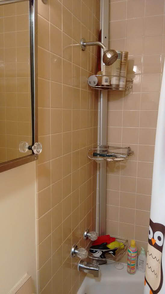
My favorite thing about my bathroom is the linen laminate in a beige-tan. It is a small multi-directional pattern that reads as a solid from a distance…so mid-century! The tile in the bathroom is beige-tan with little specks in it. The floor is small random mosaic in two-tone beige and rusty-brown.
I used to spend a lot of time on the internet trying to decide how I would like to remodel this room, even though the tile is in good shape and I wasn’t planning on adding any space or functionality. I just didn’t like it. I came across your blog when I googled “hexagonal tile.” Then I was immersed in your blog for weeks. When I resurfaced, I found myself looking for small random mosaic tile for my floor and for the right kind of laminate for the vanity. When you want to rip out your bathroom to replace it with nearly identical products, it kind of crosses the back of your mind that you actually sort of like your bathroom.
For the bathroom “refresh”, we replaced the towel bar in the shower. The original was rusty. We replaced the bar for the shower curtain. You wouldn’t think it would make a difference, but it was huge. The old one was scratched and rusty. We got new “lavatory legs” for the vanity. The old ones were cracked, had paint splatters and bits of rust.
I got the idea for a forest themed shower curtain from RR. I think you did a post on how to decorate a maroon bathroom. The dark tiles on the floor definitely read brownish maroon. We also got coordinating towels and bathmats.
There is not much storage space in the shower so we added a tension rod shelf (*affiliate link and Pam adds: I also have these two bathrooms — love them). I definitely got the idea for that from RR.
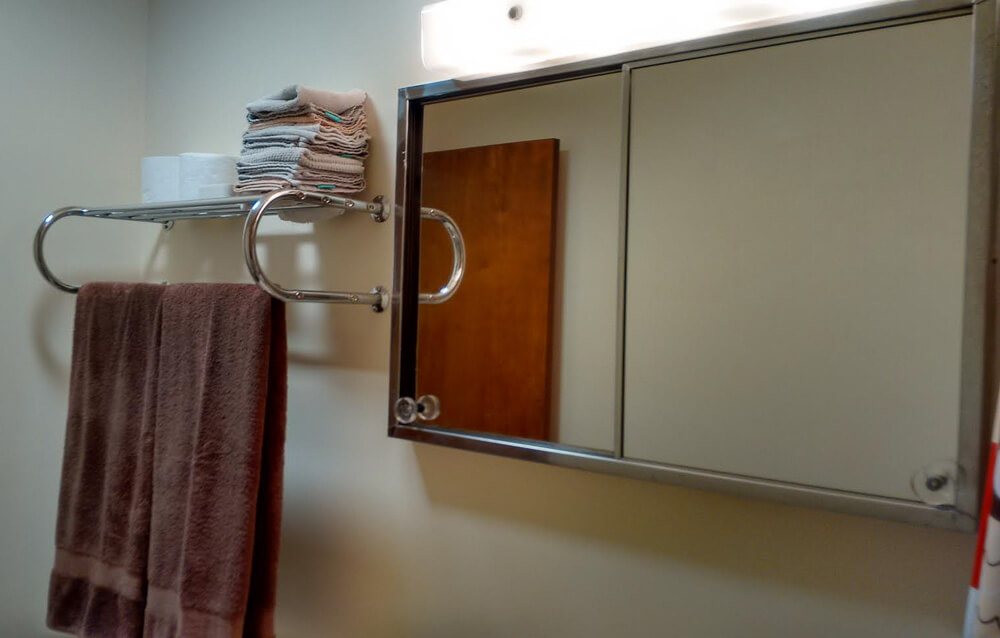
We also added a towel rack with shelf space. This is not very retro-authentic, but it is utilitarian. Also, we replaced the fan/light. That definitely was added to the to do list after reading about Kate’s bathroom fan.
The original toilet bowl was cracked, so we bought a new one at Home Depot before we moved in. That’s the biggest item that we have fixed in the bathroom.
There is no reason to store anything in the bathroom. The hall closet is just outside. The room was clearly designed for using the bath, sink, toilet and nothing else. It is so utilitarian, that there is only one outlet in the room. It is incorporated into the original light fixture and points up. You have to use a stool to reach it.
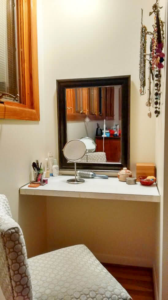
There is a small dressing table (glitter laminate) built into a nook in the bedroom for make-up. Clearly the bathroom was meant for taking care of business. Do everything else somewhere else.
Future projects: I would like to have the tub refinished and have the bathroom re-caulked. A previous owner did a terrible job.
Here is a little history on our house: I live near the University of Chicago. In the late 50’s, there was a large development of apartments and townhouses that was built near the University. I.M. Pei was the designer/architect and Harry Weese also worked on the project. Obviously, this was before either of them was a big deal. It is 4 bedroom, 1 1/2 bath house. Currently, we are saving money to expand the 1/2 bath. I’m planning on using small random mosaic tiles on the floor.
Because all of the nearby townhouses were built as part of the same development, you can see some of the other tile options that were available. A friend down the street has the same tile and laminate as mine in her en suite bathroom, but her guest bath has a teal-green tile. It is gorgeous! Someone else has a brick wall that runs through the center of their house, including the guest bathroom. The guest bathroom has pink floor tile to pick up on the pinkish tones in the brick. It is beautiful! This is a color choice that I don’t think anyone would consider today and yet, it is a perfect match to the brick.
Best, Melanie
PS-I put in apple green laminate counters in my kitchen in 2013 (I found them on your blog, natch). Everyone thought I was crazy, now it is the Pantone color of the year. You can be retro and still very, very on trend.

When we moved into our 1962 townhouse I really wanted to gut the original master bath. I found Retro Renovation within months of moving in, and I was leaning towards a pink bathroom. I did a lot of online shopping for tile and laminate patterns, and the new bathroom I settled on was the bathroom that I currently had…. Living with the bathroom for a few years saved us thousands of dollars in unnecessary renovations.
Yup. That too. Thanks for sharing your story of bathroom luv.
The post Melanie learns to love her vintage bathroom — in a 1962 townhouse designed by I. M. Pei (!) appeared first on Retro Renovation.


No comments:
Post a Comment