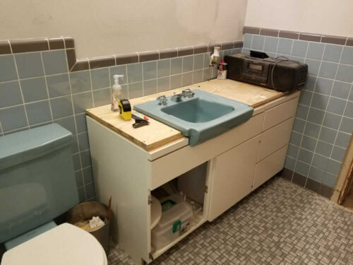
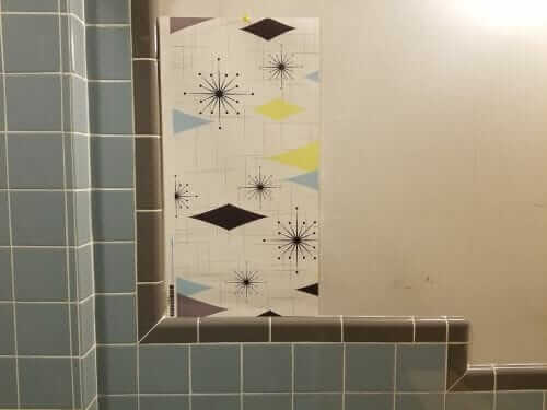
 Matt has been constructing this blue and gray tiled bathroom in his 1959 home — all from scratch — oh my — it’s fabulous! Now, it’s time to choose wallpaper. He’s found a contender but sends in this question: Does his wallpaper choice have an authentic midcentury look? I opine.
Matt writes:
I’ve been recreating a blue / gray bathroom since early last year, and I’m finally at the point where we choose wallpaper. We found a pattern we really like that has a blue / gray scheme that’s similar to our tile and fixtures with a yellow accent.

You would have to see the colors (I have a couple of pictures) but I’m wondering how authentic this might be? I don’t see very many blue bathrooms, let alone blue with a hint of yellow anything mixed in there. For what it’s worth If we go with this I’m thinking white towels so it would be just a pop of color.
Our goal is something that looks like it’s been there since the house was built in 1959. It’s basically down to wallpaper, building the hamper, someone changing our salvaged green bathtub to blue, and small details so we’re getting really close to the end!
The bathroom is changing quickly though, for example if our two year old cooperates the countertop may be tiled by the end of the weekend. Likewise the tub I’m hoping can be enameled in blue soon.The tile and plumbing supply fixtures are new. Cabinets, lighting and other fixtures are salvaged. We’ve used a lot of the resources available here for tile and fixtures, by the way. We’re definitely glad all of it was available.
Choosing wallpaper that looks authentic to the midcentury era
“The look” of vintage wallpaper vs. much of today’s wallpaper
- Old paper was printed using actual rollers — actual ink laid down, layer after layer until the desired design was achieved.
- The paper stock also was — pretty papery — they can be tricky to install for that reason — they may tear or otherwise be brittle or fragile.
- From a design perspective, old wallpapers also often had metallic inks…
- They often had striations in their background…
- More typically than not, I’d say, they had relatively small patterns… and, I’ll say:
- Few bright (blue) whites / mostly yellowed pinked off-whites.

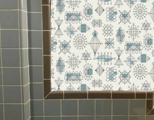
Bradbury’s Atomic Doodle in Turquoise has on off-white field in a smaller pattern, and it’s hand-printed.

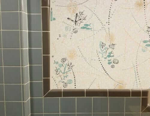
A vintage bathroom wallpaper from Rosie’s Vintage Wallpaper
- 7 places to buy vintage wallpaper
- Bradbury & Bradbury Art Wallpaper still does old-fashioned printing with inks and has retro designs
- See all my wallpaper stories / research here
- Tip: Get samples of true-vintage or layered-ink and you compare them with digital, and you will see the difference
The post Choosing wallpaper for Matt’s new blue and gray bathroom designed to look like it’s always been there appeared first on Retro Renovation.
No comments:
Post a Comment