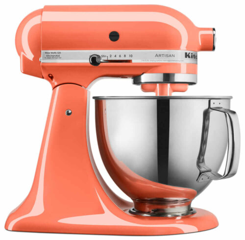
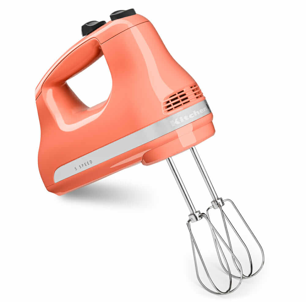
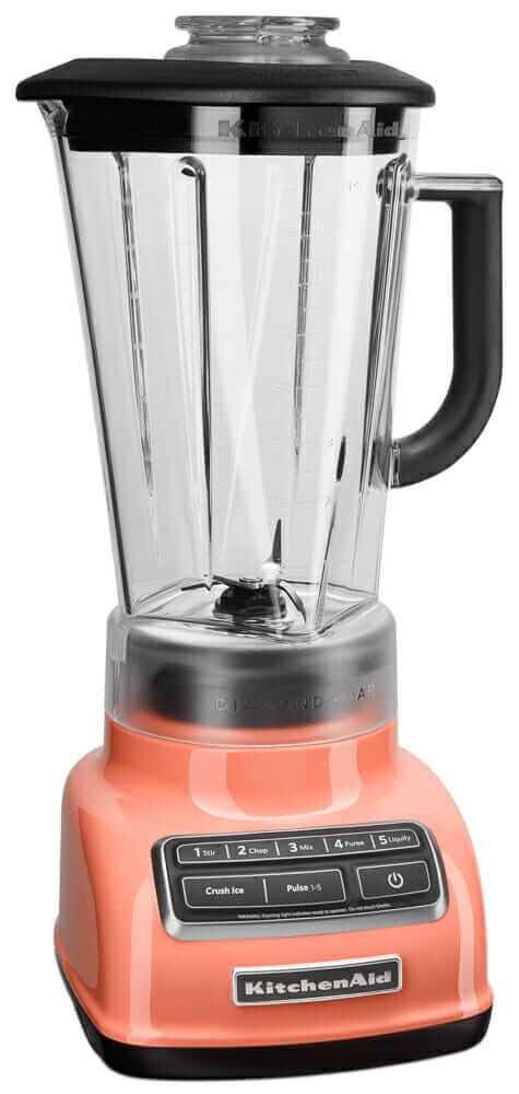
 Kitchenaid mixers already come in more colors than the rainbow and now, the company is adding a new one — Bird of Paradise — a luscious lipstick coral. Jumping on the popular Color of the Year bandwagon, Kitchenaid’s inaugural pick is a lovely one indeed. Thanks to reader Catalina for this tip!
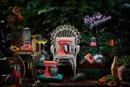
In their news release, Kitchenaid says Bird of Paradise “embodies the lush, tropical paradise, an escape from the
everyday.”
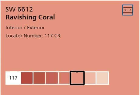
My hallway is painted Sherwin-Williams Ravishing Coral — repeated from a little streak in the original 1951 linoleum tile. This is a terrific color.
“The vibrant coral hue is uplifting and fresh with just a touch of nostalgia,” said Jessica McConnell, Senior Manager, Color, Finish & Material Studio, Global Consumer Design. “It looks great on its own, but, also pairs beautifully with the deep, lush greens we are seeing everywhere in interior design right now.”
Personally, I’m way into coral + chartreuse + teal with dashes of black and ruby. Think: Tropical barkcloth from the 1940s.
 For full-on retro, I suggest: Coral complemented with chartreuse, teal, black and a wee hint of ruby red.
The color will be available on five countertop appliances, all shown in this story.
KitchenAid’s history:
Nice little video here!:
Nicely done, Kitchenaid!
The post Kitchenaid’s first-ever color of the year: Coral by another name looks just as sweet appeared first on Retro Renovation.
No comments:
Post a Comment